
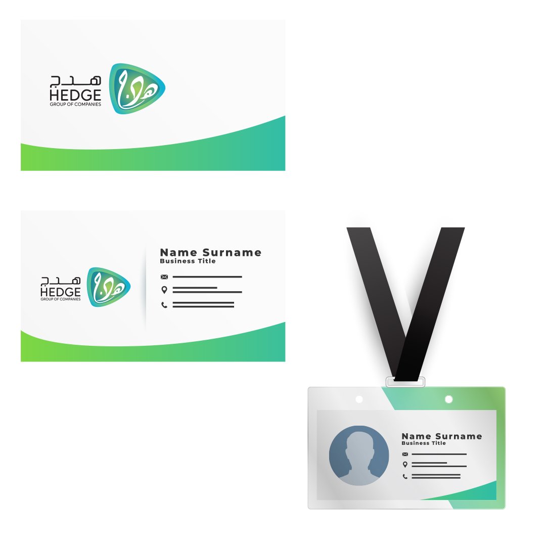
Left Section: The word “HEDGE” is written in bold uppercase Latin script, with “GROUP OF COMPANIES” in smaller, lighter text below. Above it, there is Arabic text (هــدج) representing the same brand name.
Right Section: A uniquely shaped triangular emblem with soft curves, blending green, teal, and blue gradients, giving it a modern and organic feel.
Inside the emblem is an elegant Arabic calligraphy stylization of the word “هدج” (Hedge).
The gradient of blue, teal, and green signifies growth, trust, innovation, and sustainability—common themes in diversified business groups.
The black typography provides contrast and clarity, reinforcing a professional and stable brand identity.
The combination of Arabic and English elements highlights the company's bilingual identity and broad market engagement—likely with both regional (Middle East) and international operations.
The soft triangle shape resembles a shield or leaf, symbolizing protection, unity, and organic growth.
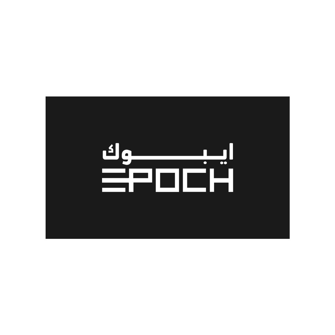
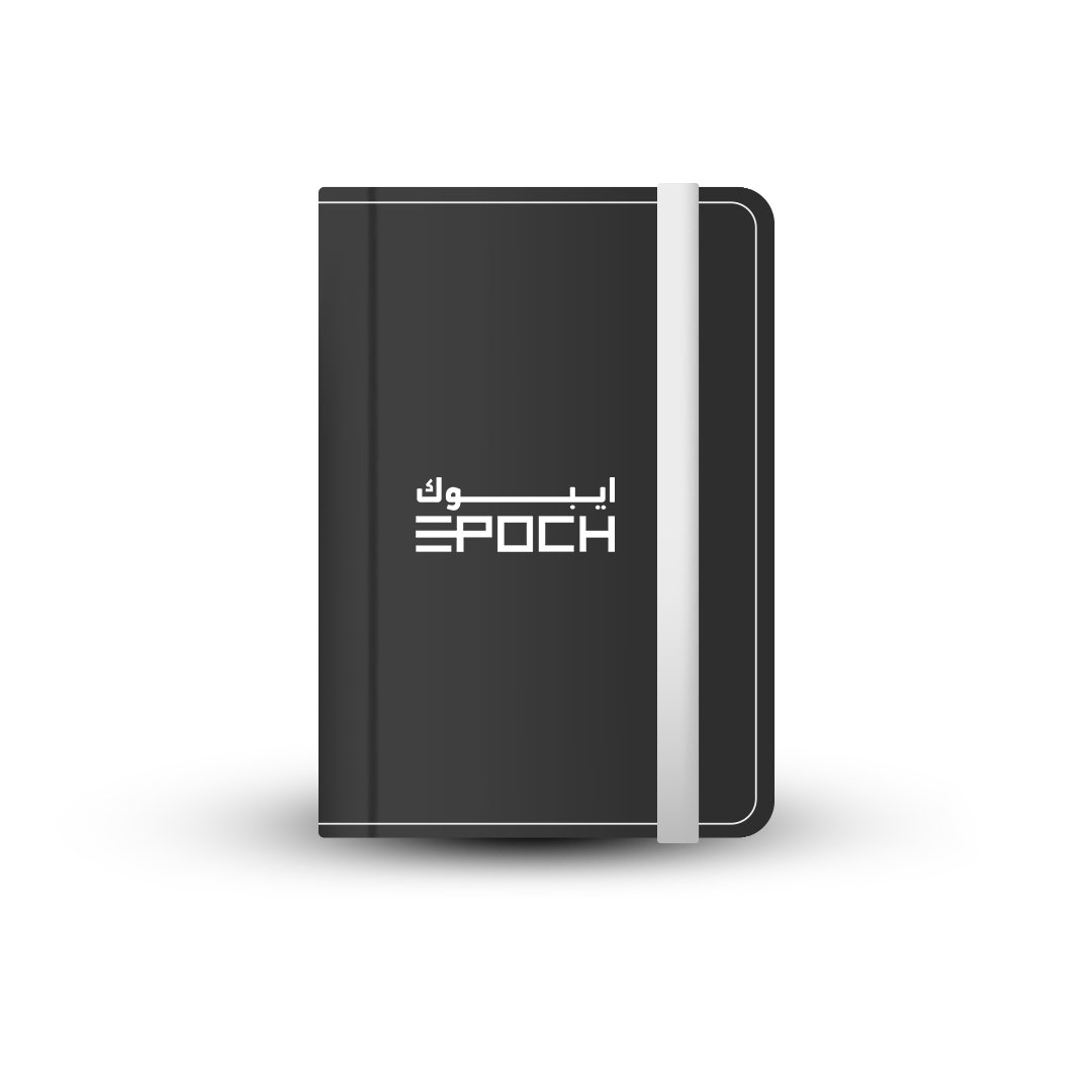
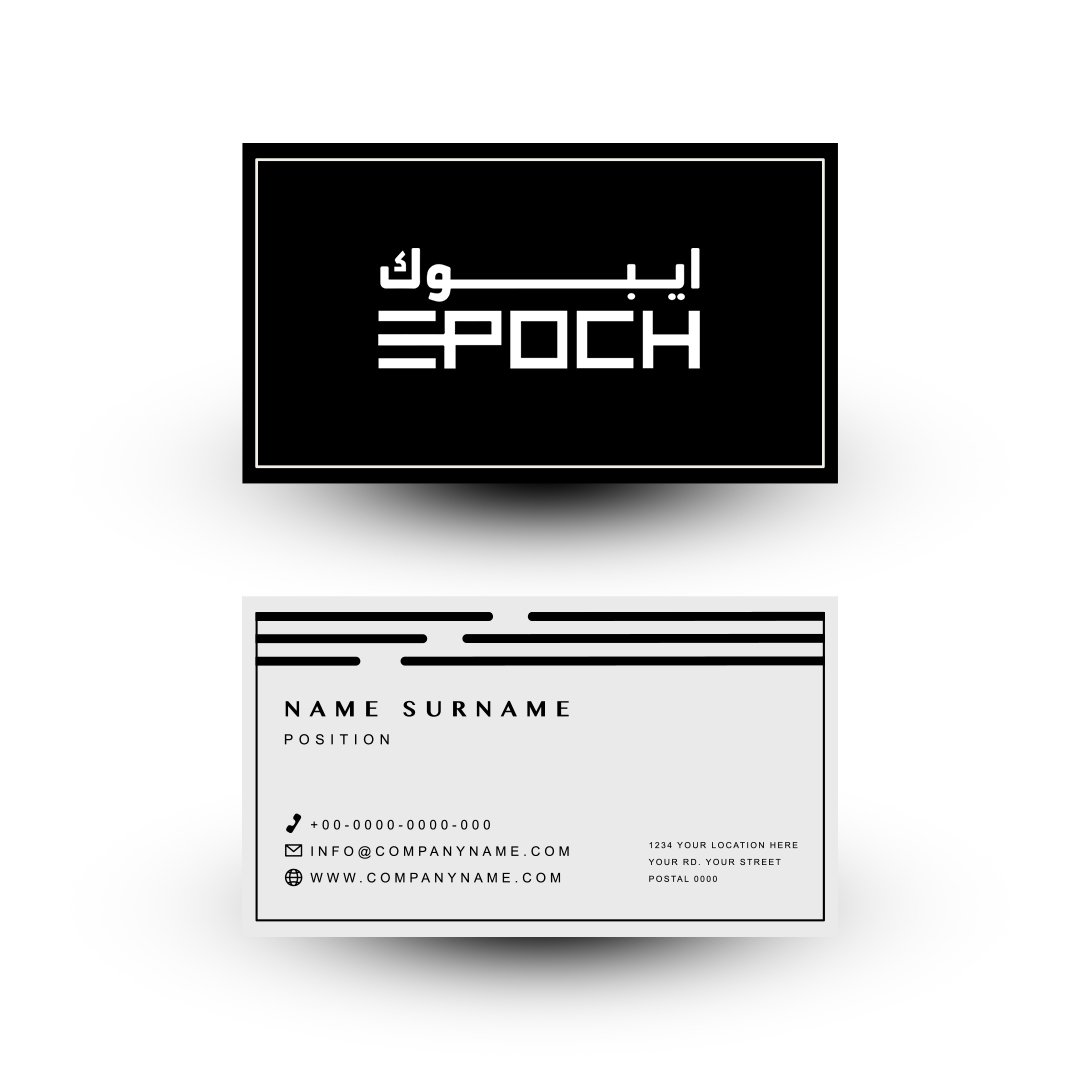
The EPOCH logo is a sleek and contemporary bilingual wordmark that integrates both English and Arabic elements in a cohesive and balanced design.
Top Section:Displays the Arabic translation of the brand name "Epoch" in bold black Arabic script: "إيبـوك". The Arabic text is clean, minimalistic, and spans horizontally across the top, giving it a sophisticated appeal and regional authenticity.
Bottom Section:Features the English word EPOCH in a geometric, custom-styled uppercase typeface. The font is modern and blocky, with thick lines and sharp corners, conveying strength and innovation. Each letter is uniformly styled, contributing to a futuristic and architectural look.
Color:The entire logo is rendered in solid black, ensuring versatility and high contrast across various backgrounds and branding materials. The monochrome style adds elegance and allows it to work well in both digital and print mockups.
Design Impression:The bilingual nature of the logo reflects cultural inclusivity and a forward-thinking identity, making it ideal for international or Middle Eastern markets. The sharp, tech-inspired lines also hint at industries like technology, engineering, or innovation.
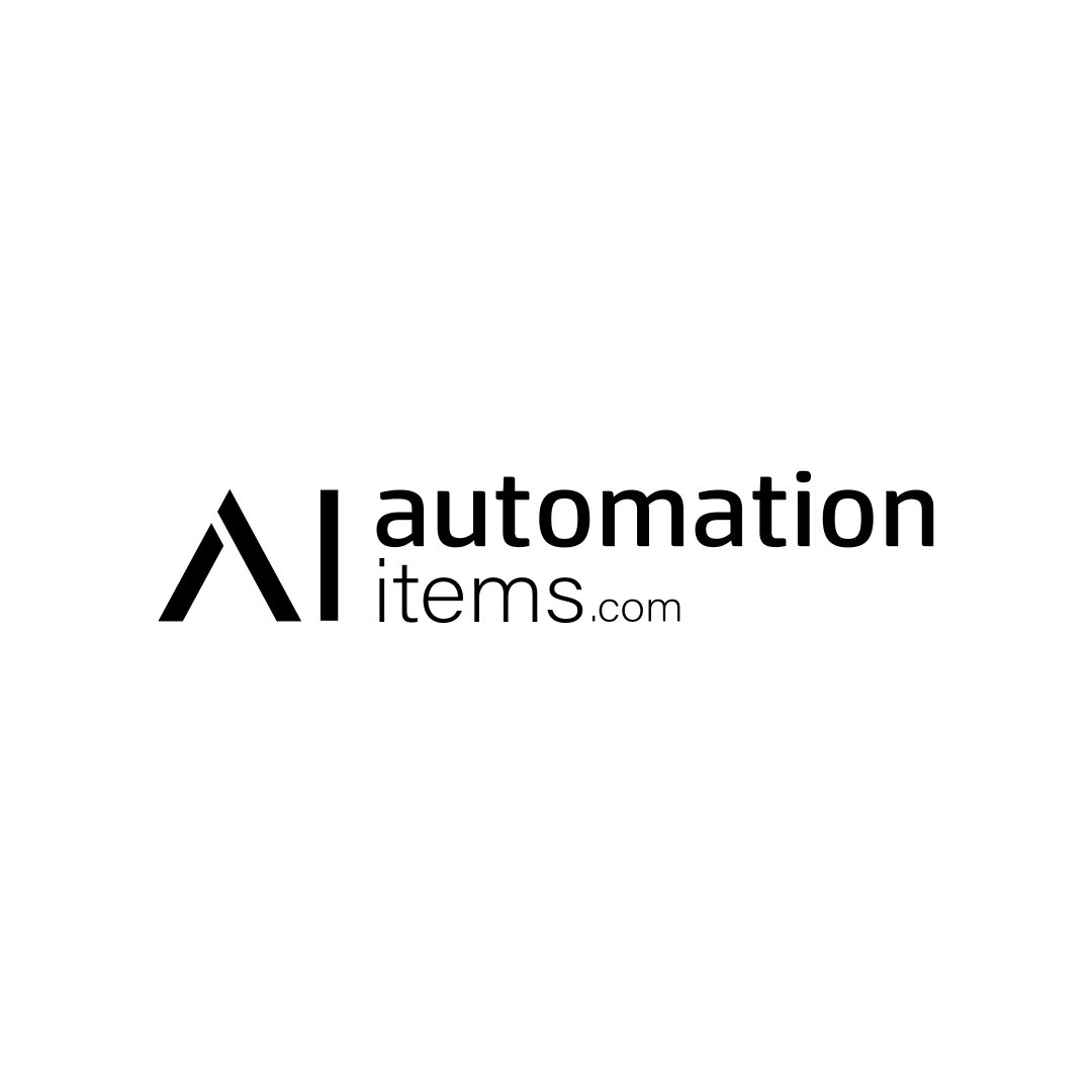
The logo features a stylized “AI” monogram made of sharp, clean lines.
The letter A is formed by two bold teal blue strokes, giving a modern, industrial, and high-tech feel.
The letter I is represented as a vertical teal rectangle to the right of the “A,” balancing the composition visually.
The choice of teal blue implies technology, trust, and innovation.
The text “automation” is written in a lowercase, rounded sans-serif font, in a dark gray color—giving it a friendly yet professional appearance.
The word “items.com” is placed below "automation" in a smaller size, with “items” in dark gray and “.com” in a lighter gray, adding hierarchy and clarity.
The “i” in “automation” is styled with a teal blue dot, matching the monogram color, subtly reinforcing the brand’s initials "AI".
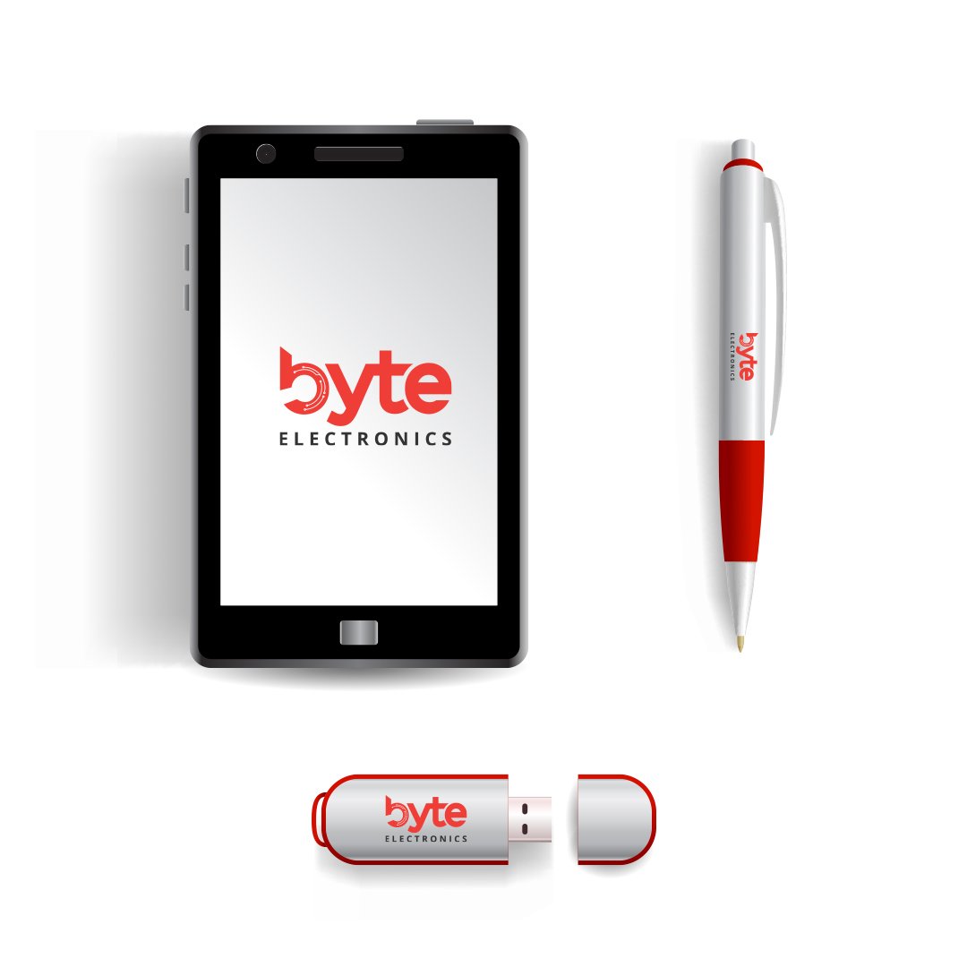
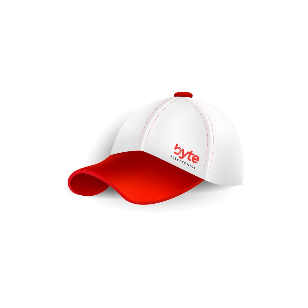
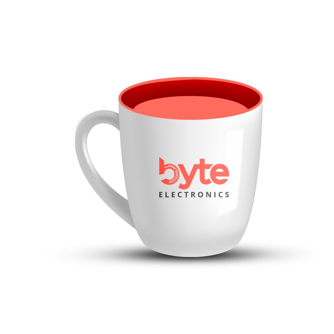
The word "byte" is written in all lowercase letters with a bold, custom sans-serif font.
The letter "b" is stylized to form a semicircle with a sharp vertical bar, incorporating circuit-like lines and nodes, symbolizing digital technology or electronic circuitry.
The letters "y," "t," and "e" are also stylized in a clean, geometric form that complements the tech-driven theme.
The word "byte" is in vibrant red, evoking energy, power, and passion, often associated with technology brands.
The word "ELECTRONICS" is placed below in a smaller, uppercase font in black or dark grey, providing contrast and professionalism.
The circuit traces inside the "b" visually represent electronic components and connectivity, aligning perfectly with the business domain.
Design: The icon is an abstract letter "A" formed by two overlapping ribbon-like segments.
Colors:
Left stroke: Shades of blue and purple.
Right stroke: Gradient from pink to orange.
Small circle: A standalone light blue dot placed below the intersection, enhancing the dynamic visual appeal.
Meaning:
The vibrant gradient symbolizes innovation, diversity, and the digital experience.
The intersecting lines may imply collaboration or connectivity, key elements in eCommerce platforms.
The circle can represent a product, user, or node in a network — emphasizing engagement or focus.
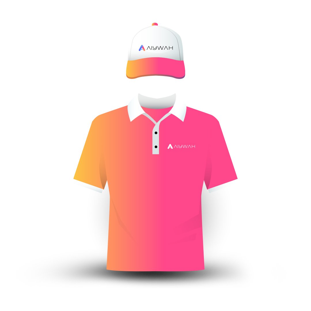
Wordmark: "AIYWAH"
Font Style: Minimalistic, geometric, and futuristic — the characters are sleek and clean, likely custom-designed.
Color: Solid black or very dark gray — conveying trust, professionalism, and readability.
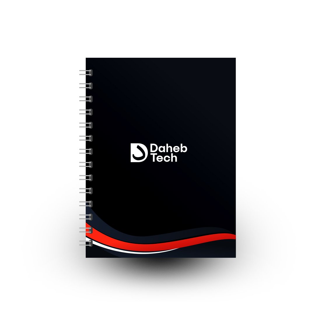
The icon appears to be a stylized letter "D", which also cleverly incorporates a drop-like shape or flame, potentially symbolizing energy, transformation, or fluidity in technology.
The curved shape is actually the Arabic letter 'د', adding cultural relevance and a unique identity, which is fitting for a tech company.
The brand name “Daheb Tech” is written in a clean, bold sans-serif font, conveying modernity, clarity, and confidence.
The two words are stacked vertically, giving the logo a compact and balanced structure.
The font choice and spacing provide a professional and approachable look, suitable for a forward-thinking technology firm.
The logo is entirely black (or very dark), suggesting elegance, authority, and simplicity. It also makes the logo versatile for both digital and print media.